Feb 5, 2025
Some brands start with a trend. Silvelle started with a frustration.
Too many steps. Too many products. Too much noise. Somewhere along the way, skincare stopped feeling like self-care and started feeling like a second job. The idea behind Silvelle was simple: strip it back, but make it better.
This wasn’t about chasing the next big thing. It was about creating something that felt intuitive, effortless, and actually worth using. And like any brand built with intention, it took time, collaboration, and a refusal to overcomplicate what should have been simple from the start.
The Foundation
The vision for Silvelle wasn’t about “redefining” skincare—it was about removing the excess and refining what remains. The products had to work without demanding too much from the person using them. No 10-step routines, no overhyped ingredients, no false promises. Just effective formulations designed to feel good on the skin and even better in your routine.
This philosophy extended beyond the products. Everything about Silvelle—how it looked, how it felt, how it fit into daily life—needed to reflect that same ease. A brand built on restraint, not excess.
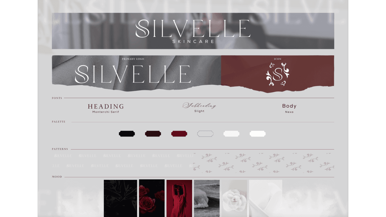
The Visual Language
Skincare brands tend to fall into one of two camps: clinical minimalism or over-the-top luxury. Silvelle carves out its own space—one that feels effortless but never dull, sophisticated but never cold.
The logo, a fluid, embellished “S,” is subtle but distinctive, meant to evoke ease and elegance without screaming for attention. It’s balanced by a color palette that walks the line between moody and neutral: deep espresso, rich wine, soft silvers, and crisp whites. It’s a palette designed to feel timeless—not tied to trends, not begging to be noticed, just quietly confident.
The packaging follows the same logic. Tactile, unfussy, and meant to look as good on a bathroom shelf as it does in a travel bag. Every detail serves a purpose.
The Process
Building Silvelle meant cutting through the noise. The goal was always balance: effective but gentle, luxurious but approachable, modern but not fleeting.
The same level of care went into the branding. From the typography to the packaging textures, every element was carefully calibrated to reflect the essence of Silvelle: understated, intentional, and designed to last.
The Result
Silvelle isn’t about trends, aggressive marketing, or promising the impossible. It’s a brand that understands that the best things don’t need to shout to be noticed. Every detail—visual, tactile, and functional—was designed to feel natural, to fit seamlessly into everyday life, and to quietly stand the test of time.
No overcomplication. No over-explaining. Just a good eye-catching skincare brand, well made.
See More Posts